BA Font?
Moderators: Guru's, The Ministry
Re: BA Font?
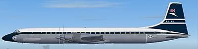
The font for the red-tail/Negus Negus livery is almost certainly Baskerville, or a customised version thereof, though I have no hard evidence!
-
Garry Russell
- The Ministry
- Posts: 27180
- Joined: 29 Jan 2005, 00:53
- Location: On the other side of the wall
Re: BA Font?
Always need to check the alignment of the dot over the 'I' as that usually needs to me lowered on most given fonts for the Negus and Negus
Garry
"In the world of virtual reality things are not always what they seem."
"In the world of virtual reality things are not always what they seem."
Re: BA Font?
Yes, well noted.Garry Russell wrote:Always need to check the alignment of the dot over the 'I' as that usually needs to me lowered on most given fonts for the Negus and Negus
Of course, the most controversial aspect of these titles was the lower case "a" in airways. But that's for another discussion...
-
DaveB

- The Ministry
- Posts: 30457
- Joined: 17 Jun 2004, 20:46
- Location: Pelsall, West Mids, UK
- Contact:
Re: BA Font?
It sure isn't easy. I've gone for one set before and it's looked wrong in the end.
ATB
DaveB
Old sailors never die.. they just smell that way!
Re: BA Font?
If you're using Adobe Illustrator or another vector art application you could convert the text to line art and edit it there. But is it worth the bother when Baskerville is so close?DaveB wrote:
It sure isn't easy. I've gone for one set before and it's looked wrong in the end.A combination of 2 or 3 fonts gets closer but then you have problems with spacing, width and overall size and you end up pulling your hair out
Getting a shot of the real thing then doing a cut and shut saves time and usually looks better

ATB
DaveB
-
WhisperJet

- Concorde

- Posts: 912
- Joined: 18 Nov 2008, 14:33
- Location: LOWW
Re: BA Font?
Hi Tony,
I just come back from a little websearching. I have no real find for you, but some thoughts I want to let you know...
Companies as huge as BA mostly have their own fonts created customized for them. E.g. Ford customize Helvetica to their own desires, so do Mercedes-Benz, Coke or other world brands. The current BA type was redesigned in 1997 by "Newell & Sorrell" by a certain Mr. Rodney Mylius, that's why it's called "Mylius" and one can't find it on the web. The agency doesn't exist anymore (merged into Interbrand) but here's the current Logo with colour definitions:
http://users.ncrvnet.nl/mstol/britishairways.html
As I've been working in automotive marketing for years please allow me to add the following (just in case you haven't tried that already):
Why not write to a marketing contact at BA. In general: don't think it's not possible to talk to these people directly. Mostly marketing people have a strong interest that their brands are reflected as real as it gets by modellers or in virtual worlds. I think it would be worth a try to send them a mail, explain what you're doing and add some jpegs of your workd - they might send you a copy of the font, so you can just install it. They even might have access to type font files of the past.
At the company I was working for, we have very often got similar requests. We chose carefully who we were sending it to and we asked for file copies - but we definitely supported this in advance of having it done falsely.
You might also try Landor directly...
http://www.landor.com/index.cfm?bhcp=1
Cheers & all the best,
Nick
PS.
Finally, off topic but a nice find for those who like BA's current design...
http://www.leecollins.co.uk/batails.htm
Noise Abatement? Never.
(D. Maltby)
(D. Maltby)
-
Garry Russell
- The Ministry
- Posts: 27180
- Joined: 29 Jan 2005, 00:53
- Location: On the other side of the wall
Re: BA Font?
In fact Nick ALL the older titles are not fonts but specific designs, it's only a few more recent liveries that use known font's
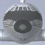
Try for eaxample to get the BEA Red Squarte lettering.
The timetable lift is the usual ploy
Try for eaxample to get the BEA Red Squarte lettering.
The timetable lift is the usual ploy
Garry
"In the world of virtual reality things are not always what they seem."
"In the world of virtual reality things are not always what they seem."
Re: BA Font?
Tony,
Much like Nick I have been doing a little websearching, courtesy of my friend Mr Google. Echoing Nick's comments about contacting the marketing department, you may well find them amenable as it doesn't look as though BA are completely precious about this font; apparently there was a period when, if you downloaded their timetable, the font was automatically installed on your system - could be worth checking to see if that still happens!! Obviously this means that there are copies of the font out there "in the wild" so to speak, but it is obviously best to stick to the legal avenues. Oh, and strictly speaking the font is "Mylius sans".
One avenue of research identified "Optima" (an Adobe font) might be a suitable alternative.
Re: BA Font?
Nice find, I think I'm probably the only person round here who liked the world tails. I thought they had huge potential for spin-off branding/merchandise for the airline. The brouhaha over "not flying the flag" is ridiculous when you consider that for many years neither Imperial nor BOAC felt the need to plaster the Union Flag over their tails as a logo yet were highly regarded around the world, and until 1968 BEA didn't feel the need to have a Union Flag logo either, in my view the 1950's BEA livery is classically British with a proudly displayed modest full flag on the tail, and the Red Square livery remains a classic, showing you can have a stylish livery, with a display of the full Union Flag on the side of the aircraft without making it into a pastiche logo design statement as it has become, and which is quite insulting to the flag in a way.WhisperJet wrote:
PS.
Finally, off topic but a nice find for those who like BA's current design...
http://www.leecollins.co.uk/batails.htm
Ironically given one of the arguments for going back to "The Flag" was percieved loss of custom, it hasn't done much for their financial position.
-
Garry Russell
- The Ministry
- Posts: 27180
- Joined: 29 Jan 2005, 00:53
- Location: On the other side of the wall
Re: BA Font?
Indeed 
BOAC and BEA Always had always flown the flag, properly and complete......It was not necessary to plaster the tail with it as it is not now
The BEA flag you mention, and the BA flags are only a part of the flag made into an stylised logo for the airline.
With the BA 'Flags' I have always seen it as just a logo made from the flag I have never thought of it as a flag in the true sense......in other words I think BA and obviously it's known where they are from, NOT the UK as such......much in the way the Aer Lingus Shamrock represents Aer Lingus who every one knows is Irish.
Garry
"In the world of virtual reality things are not always what they seem."
"In the world of virtual reality things are not always what they seem."