Page 1 of 2
Registration font
Posted: 14 Dec 2008, 21:03
by decapod
I keep forgetting to ask - does anyone know of a try type font I can use for the aircraft registration letters?
What do other developers/repainters use?
They all look very similar so it should be a standard font.
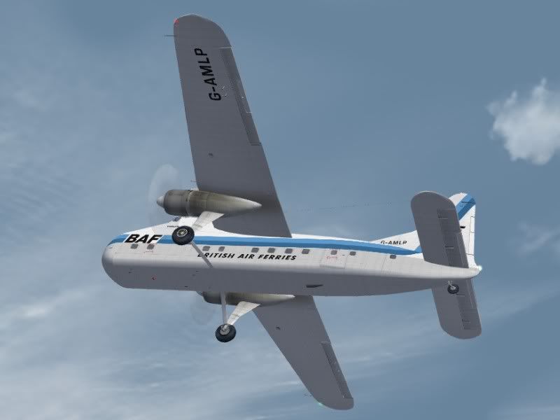
e.g.:
http://www.airliners.net/photo/Untitled ... id=0628632
Re: Registration font
Posted: 14 Dec 2008, 21:10
by Garry Russell
Hi Paul
it's not standard and it's not a font as such
That's the problem
These were hand painted by signwriters
There a few standard styles.....The most common I use is Eurostyle bold which can have the proportions manipulated to give a a few variations on the standard style
It can be seen here
Also go to simmers paintshop
http://www.simmerspaintshop.com/ and down load the serial fonts.......that will cover what Eurostyle doesn't
Garry
Re: Registration font
Posted: 14 Dec 2008, 21:25
by DaveB

Ahh.. outline registrations.. WHAT a joy :@ You will find something close-ish over at the link Garry posted but you'll undoubtedly have to squash/squeeze/pull to get them to the correct proportion. To get the effect seen in that Airliners phot, you'll need to get the reg exactly how you want it seen proportionally then use something like photoshop to add the outline effect. To do this, the reg will have to be 'simplified' and once done.. you can't go back and change a registration letter (unless you first saved a copy of the reg layer). They're not so bad to do with 'one off' paints but if you expect to do a 'fleet'.. it is a royal pain in the proverbial. Chasing suitable fonts is a painters nightmare and rarely do they look right straight out of the box. As Garry says.. these things were hand painted and had a habit of being slightly different with each aircraft :roll:
They're satisfying when you get em right but they're rarely as easy as 'select font' and there you go ;-)
EDIT.. a quick thought..
If you aim to do a number of paints with that sort of reg (eg.. outlined).. it might be a good idea to get the letters to the right proportions then type all the letters in the variations you intend to use and save that as a bitmap. You can then build them up without having to go through the palarva above.
ATB
DaveB :tab:
Re: Registration font
Posted: 14 Dec 2008, 21:37
by Garry Russell
Indeed Dave.as mentioned above they need manipulating
The reg on that Superfreighter is squashed up and there are two hyphons having said that most applications use the same settings.
Each letter has a space between so you see what I mean about being squashed
Outlines can be done on the stroke function or like I used to have to do it in Photostudio. ....that is copy the letter in the outine colour four times and displace each layer one direction..sometime you need the odd extra one to smooth curves.
Nowadays they are fonts like on BA Red tail and beyond.
Another thing... sometimes they had more rounded lettering on the fuse which was harder and more expensive so on the wings the reg was different and more sqaure.
Quite a few Doves and Herons were like that.
But the fact the older stuff is not a true font is bourne out by so many decal sheets for kits having the wrong registration style, something that has always irritated me :@
It is not unusual for me to spend three of four times longer on the titles and registration than on the livery
Title again were special so they often need had drawing, tracing or mofified font.....often a combination of all of that. it is hard yo get a logo or Photo good enough to use on the older subjects.
Garry
Re: Registration font
Posted: 14 Dec 2008, 21:53
by DaveB
Hello Mate

Ohhh yea

You can also add to those older, outline types those that have certain letters like G and C that have the begining of the curve cut at an angle so when you've fiddled, squashed, pulled, respaced and got looking there or thereabouts (many don't have hyphens so a box of the correct size has to be drawn).. you then have to cut the angles on the necessary letters THEN repaint the outline on the severed section. Ain't paintin' good fun!
While we're here in the public arena.. it has to be said that without your patience and encouragement, I'd have given up long ago

As it is.. many will probably wish I had but it's kept me off the streets even though I'm never 100% happy with anything I've ever done
ATB
DaveB :tab:
Re: Registration font
Posted: 14 Dec 2008, 22:12
by Garry Russell
Hi mate
Well I'm glad you're never 100 percent happy with what you've done as that little niggle is what drives you forward
I always knew you could do it really and all I did was gave you a gentle little nudge now and then and the rest is down to yourself

It does give you a great sense of satisfaction though when after a difficult job you pan it back and it looks just like you hoped.....or at least 99 percent of what you hoped for
Garry
Re: Registration font
Posted: 14 Dec 2008, 23:31
by DaveB
99%.. my favourite percentage
I plan to learn how to do curves next (as in.. draw bendy lines). This may be a bridge too far as I often don't see straight
Paul.. I hope all this has been useful and has not in anyway discouraged you. Bottom line.. if painting was that easy, then everyone would be doing it. Same goes for making models.. doing flight dynamics etc, etc ;-) Keep chipping away and you'll get 99% of what you're looking for ;-)
ATB
DaveB :tab:
Re: Registration font
Posted: 15 Dec 2008, 07:32
by decapod
Thanks for the info guys,
At least in train sims we have a relatively small number of fonts.
Outlining should not be a problem. My package (Picture Publisher) has several functions which will do this.
Re: Registration font
Posted: 15 Dec 2008, 12:11
by DaveB
Hi Paul..
There are probably 3 fonts that come close to what you want (from that link).. RAF_WW2_641ATH.. 841ATH-GIMP and 851ATH. 641ATH is a little bolder but the downstroke on the G isn't quite long enough so you'd have to draw that in. 851ATH isn't too bad but again, the downstroke isn't there. Flip a coin but I'd probably go with 841ATH-GIMP. The bottom of the downstroke isn't as thick as 641ATH but having just tried it.. only the owner of the real aircraft would complain. Nice and easy to cut the angle off the G too ;-) Both 641ATH and 851ATH can be seen used on registrations down in the VA forum under Aircraft and Routes.. Lancastrian paints.. almost certainly York paints and also under Rapide paints, some of which I had to cut G's and C's!
ATB
DaveB :tab:
Re: Registration font
Posted: 15 Dec 2008, 13:57
by decapod
First attempt with the 641ATH and a few mods looks OK.
Pity I don't have FSX at work to try it out.


