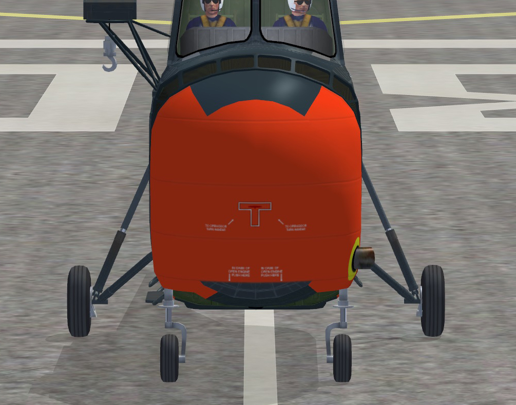
The trauma continues with these 'easy' paints for the Whirlwind

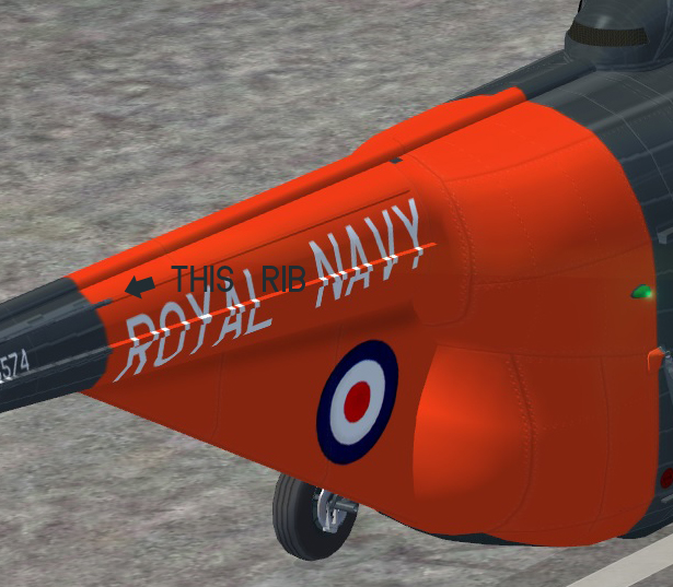
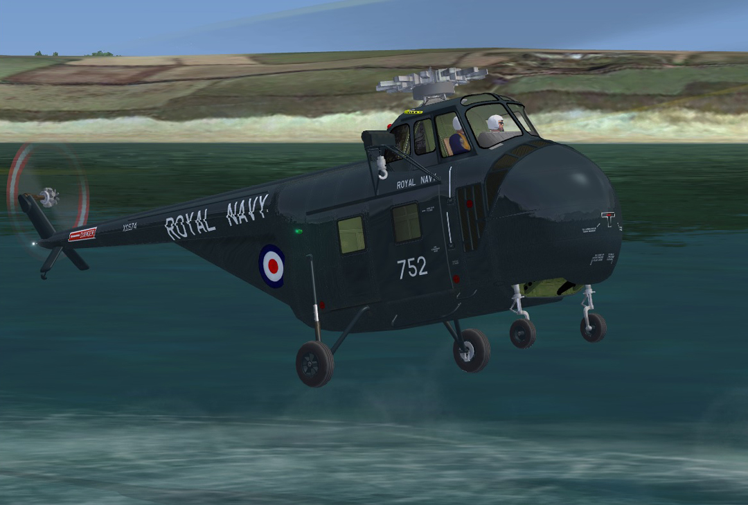
When I tried to make the ROYAL NAVY boom titles match the real thing.. this happened:
Having them proportionally correct on the S-55 (XG574 is an HAR3 mit bent boom).. the bottom of the titles disappeared under the fillet mapping. I could make the titles much smaller so that wouldn't happen but that wouldn't look right either

Also.. the boom reg and danger warning are not.. because XG574 has a bent boom) where they should be so they look odd too

Compromise is one thing but this is hurting a little

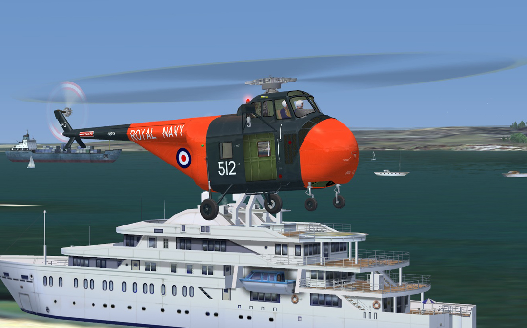
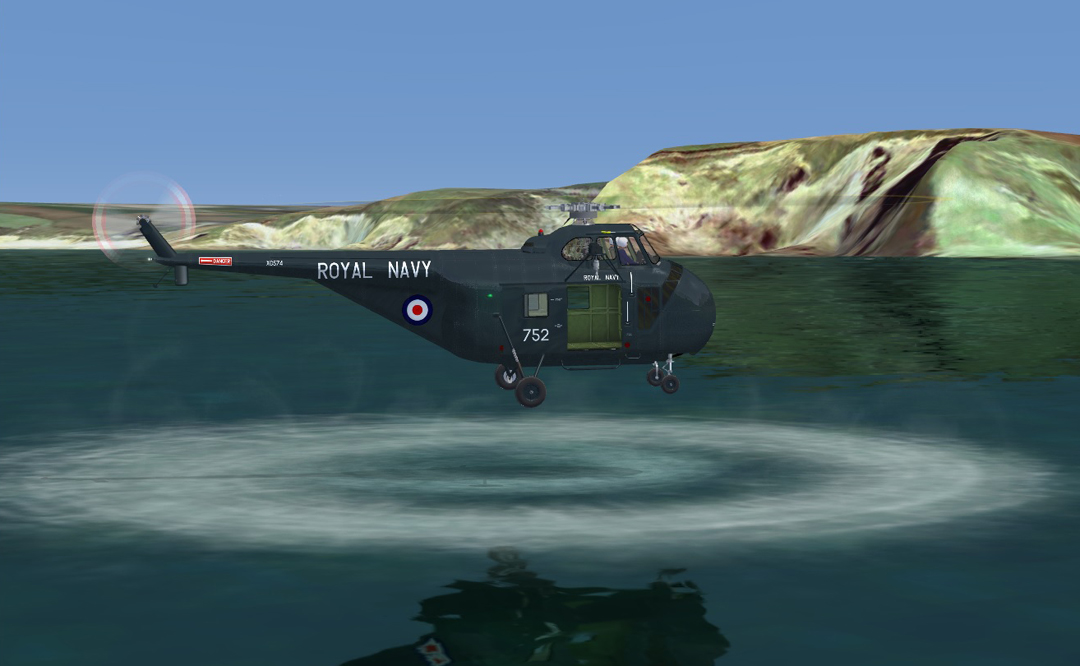
574 is, and has been for some time, a preserved airframe so her shine has been built up to how it would have looked on delivery.. not as it looks above with lots of flying in hostile conditions under its belt!
I really like this now.. unlike me I know

Titles have been moved to stop the 'map creep' and while proportionally still correct, they're now out of place as are the rest of the bits on the boom due to the S-55 boom being straight. There is however, one undesirable artefact of the darker alpha (required to make the shine more vivid) and you can see this for yourselves. The dark blue in the bottom two screenies is a quantum leap lighter than that in the first screenie even though they're both the same colour underneath
It should be possible to maintain the same degree of shine but keep the darker blue.. I just can't get my head around it at the moment

Would making a custom spec map for this colour be a way forward of have I lost the plot

As I said.. so much for a simple paint
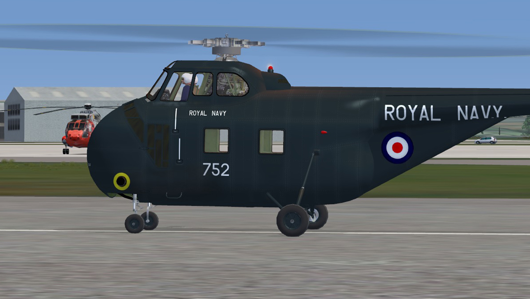
This said.. I do like the hue of blue the darker alpha produces. It has a more 'in service - in daylight' look about it

ATB
DaveB