Yes mate.. I'll let this one go when I'm about happy with it ;-)
Garry..
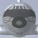
Here's how it looks with the BEA logo outlined in red (no wonder my eyes are getting b1oody worse!)
Is this what you meant?? It still looks at a 'jaunty' angle but it IS the official BEA FJ logo of the period.. squashed a little to show as it does in the shots ;-) The back line of the 'A' is straight.. not angled fwd as it appears in that shot.
No.. they're not distinctive at all (make that.. invisible to my eyes).. but I'm happy to go if that's what you think it should be.. no point in doing it otherwise There are fictional paints and paints where you have to go with what you have or not go at all. I don't care for fictional and WON'T go unless I'm sure it's a 'fair representation' given what's available.. like those Don Everall Rapides done not so long ago. If something turns up to say they're wrong.. I'll dive in and change it in a jif (or should that now be Cif) :o
I suppose BA could well be next but it'd be really nice if all this time were spent filling holes in our VA fleet.. towit there are many :roll: I can fill a few in shortish order with the Scottish Airways RAS camo.. I think :think: We'll see ;-)
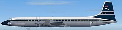
What d'ya reckon on the underwing reg mate?? All together or staggered.. G - on one side of the nacelle and the remaining 4 letters outboard?? Not done the upper although I have nothing to confirm one way or the other if GD would have worn one :think:
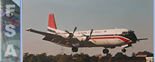
You can never have too many phots though the more I see of this, the more confused I become Wing pylons look blue on that but on another, they're definately white. Mine will stay white