Indeed.. those cheatlines look very, very close now.. so close I don't think I'd go any further. Square font for the reg too I'll see if I have anything closer for the 'Chieftain' font. It looks fine as-is and for those not sat with a picture in front of them, it'd be ok. If I can find something just a tad closer, I'll pass it on
Yes, I agree with that Garry. The more I look at the title, the more it reminds me of a BA font.. a sort of flareserif. There are fonts out there relatively close but the only way to get it to look like that would be to save the title as something else (an object) and work on it by hand. The 'W' in particular is a right swine
Thanks for the feed back, the Font used was as close as I could find on the net, but thanks for pointing me in the right direction, back to the drawing board then.
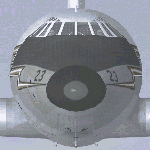
Struggling with the fin logo as the only picture I have found is very small, so any help would be appreciated of a better picture.
Happy you like the work so far and the encouragement is gratefully received from all.
No.. don't consider going back to the drawing board yet. It all depends on how visually accurate you want it to look mate and how far you're prepared to go before your hair starts falling out Fonts for titles is surely one of the most difficult things to get right as they're often, as Garry said, stylised and not available 'off the shelf'.
The fin logo didn't look too bad last time I looked.. the fuse logo too. If I were to be super critical, I'd say it should be a little wider (the fuse logo) but otherwise, it's pretty darned close. I'll have another look this afternoon
BTW.. I found a small handful of fonts that were equally close.. one perhaps a little closer but all would require work to make them look like the original. Such is a repainters nightmare